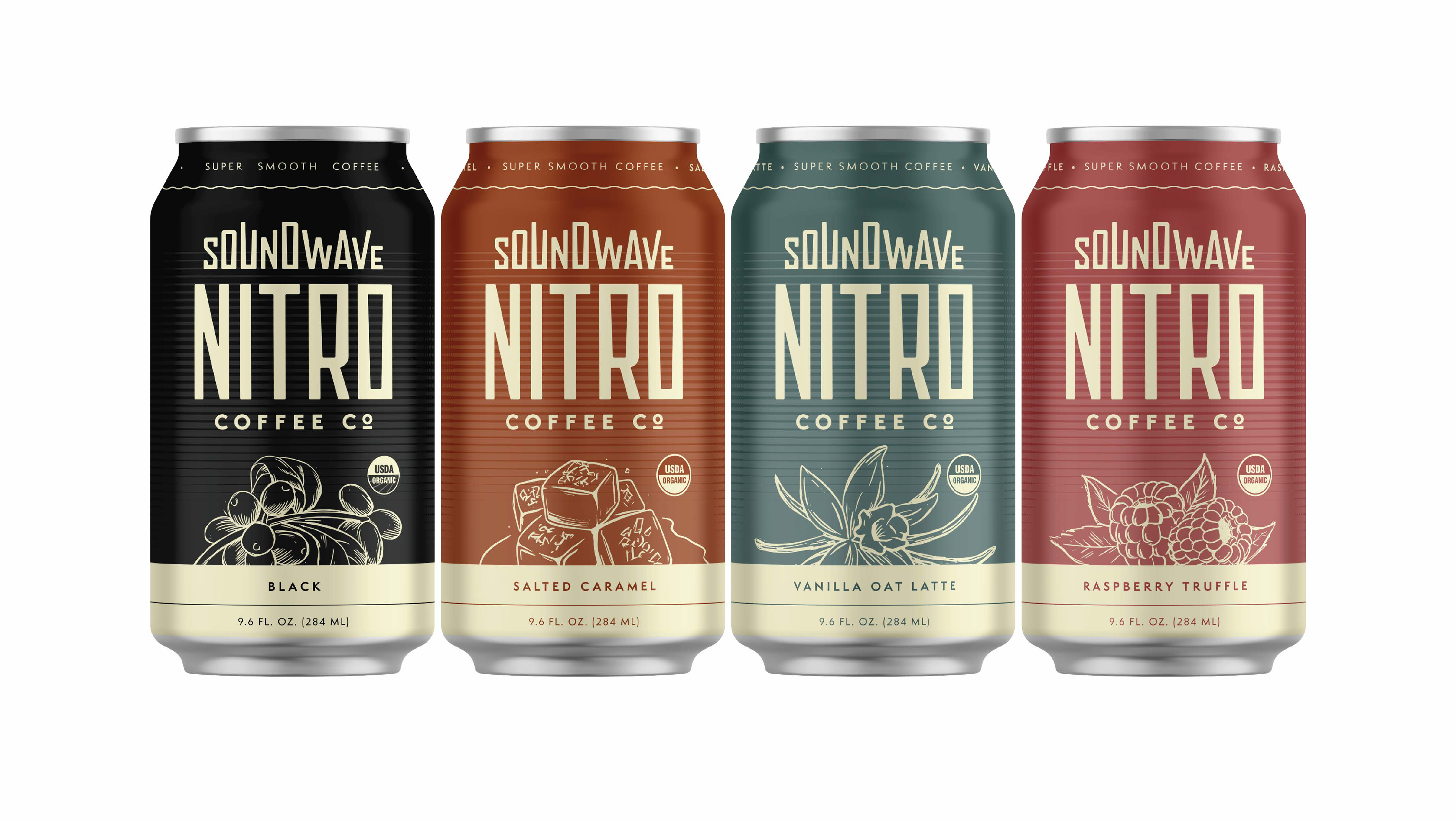
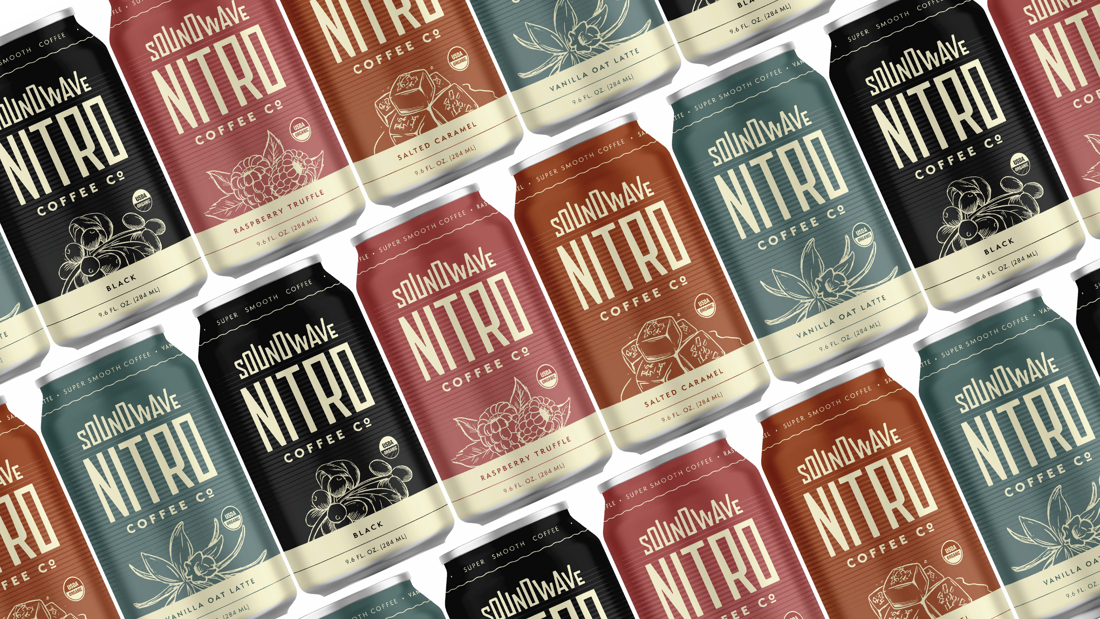
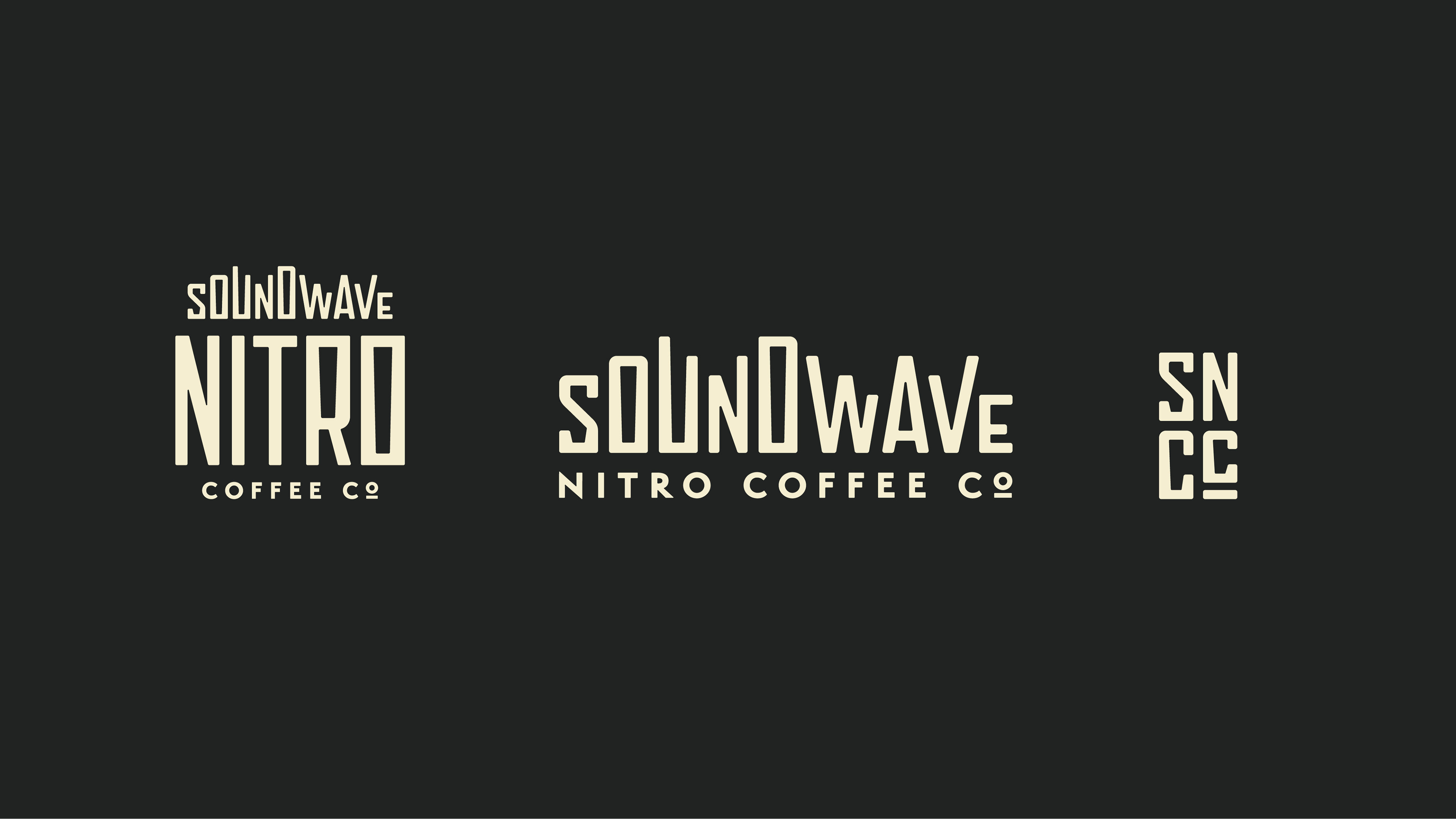
Left Hand Brewing Co. is releasing a nitro coffee line under the name Soundwave Nitro Coffee Company. They needed a logo + a can design that communicates 'Nitro' right away, stands out
on shelves, and appeals to the coffee-drinking community.
on shelves, and appeals to the coffee-drinking community.
What I promised:
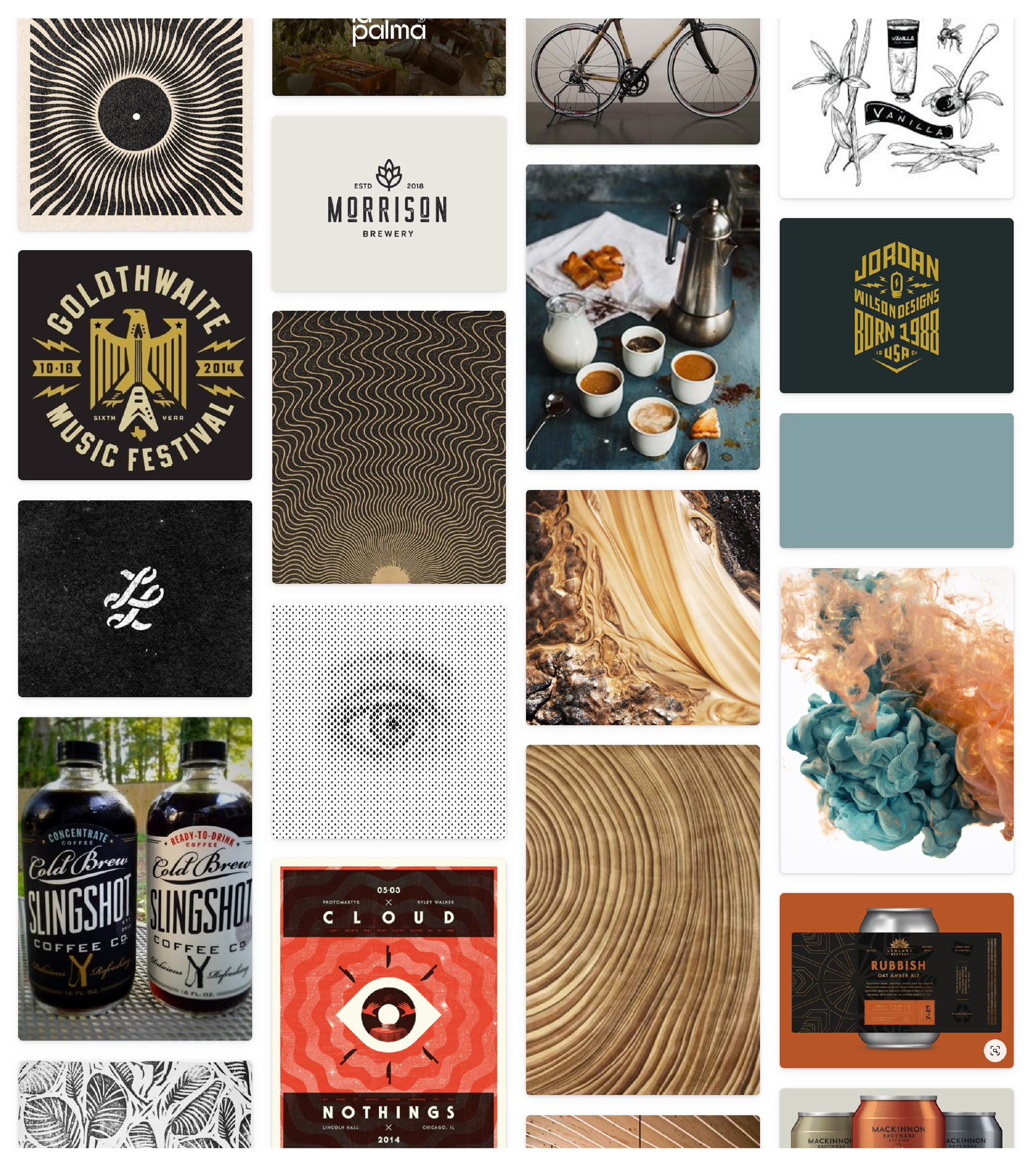
I chose these visuals to convey a bold, modern, and engaging look tailored to coffee drinkers who value convenience without sacrificing quality. Something that would go against the grain and stand out while still fitting into the lifestyle and look/feel of coffee drinkers alike.
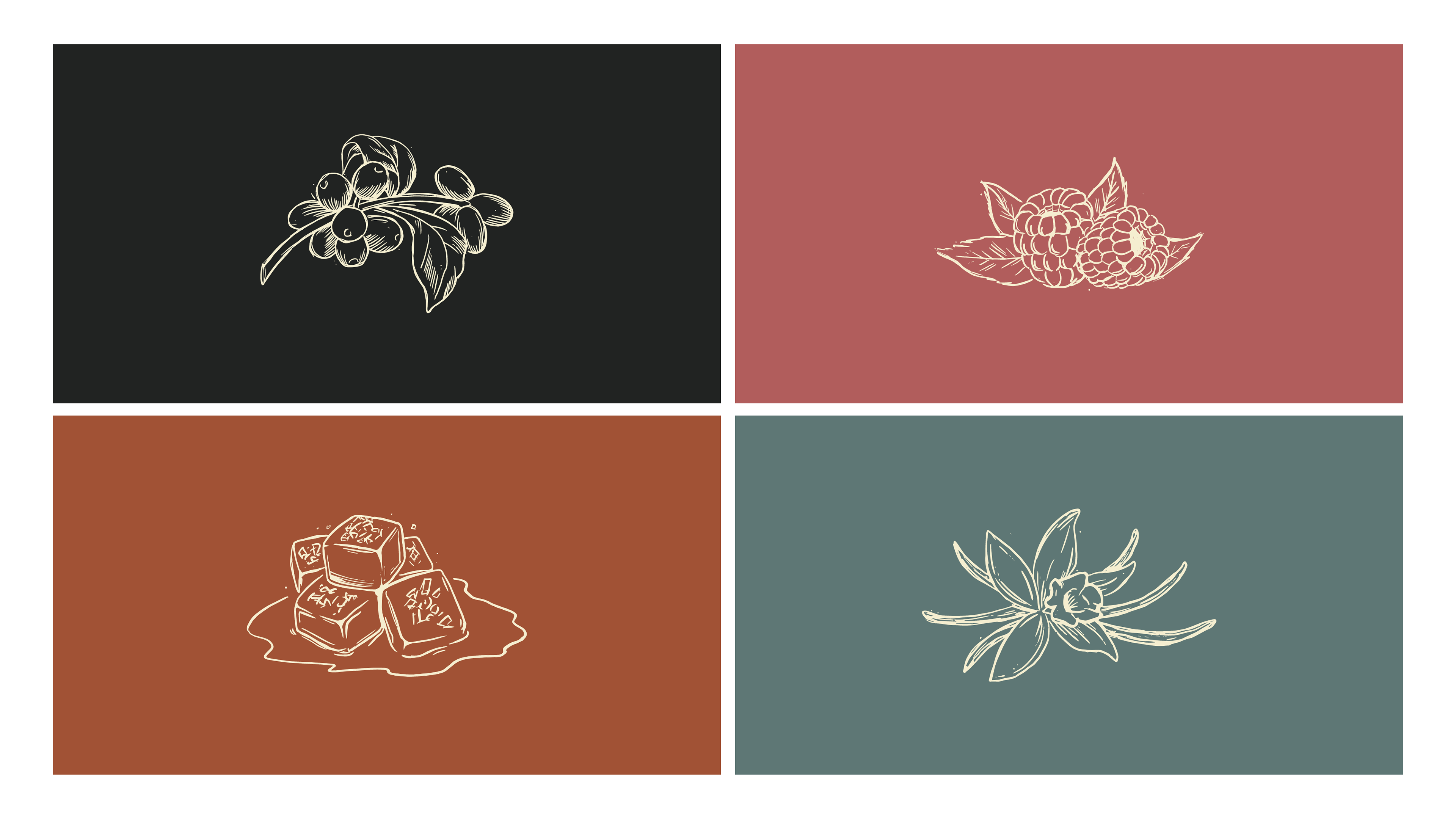
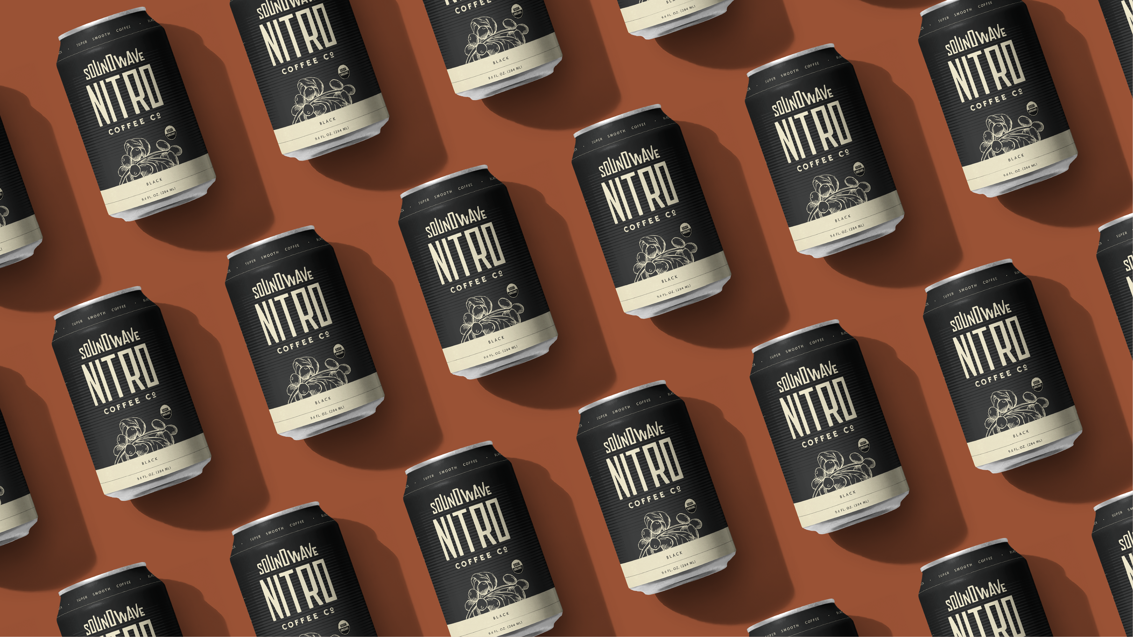
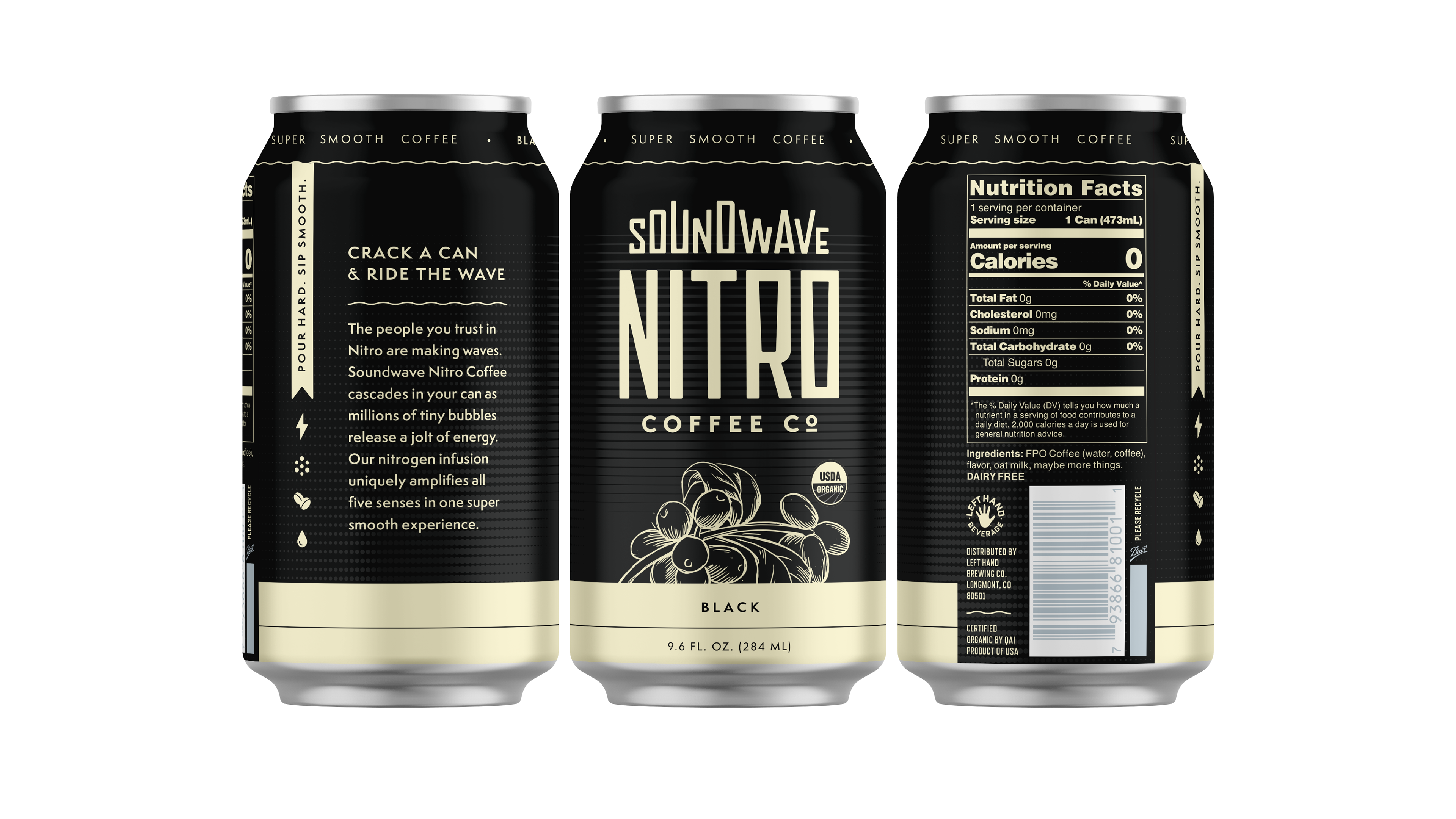
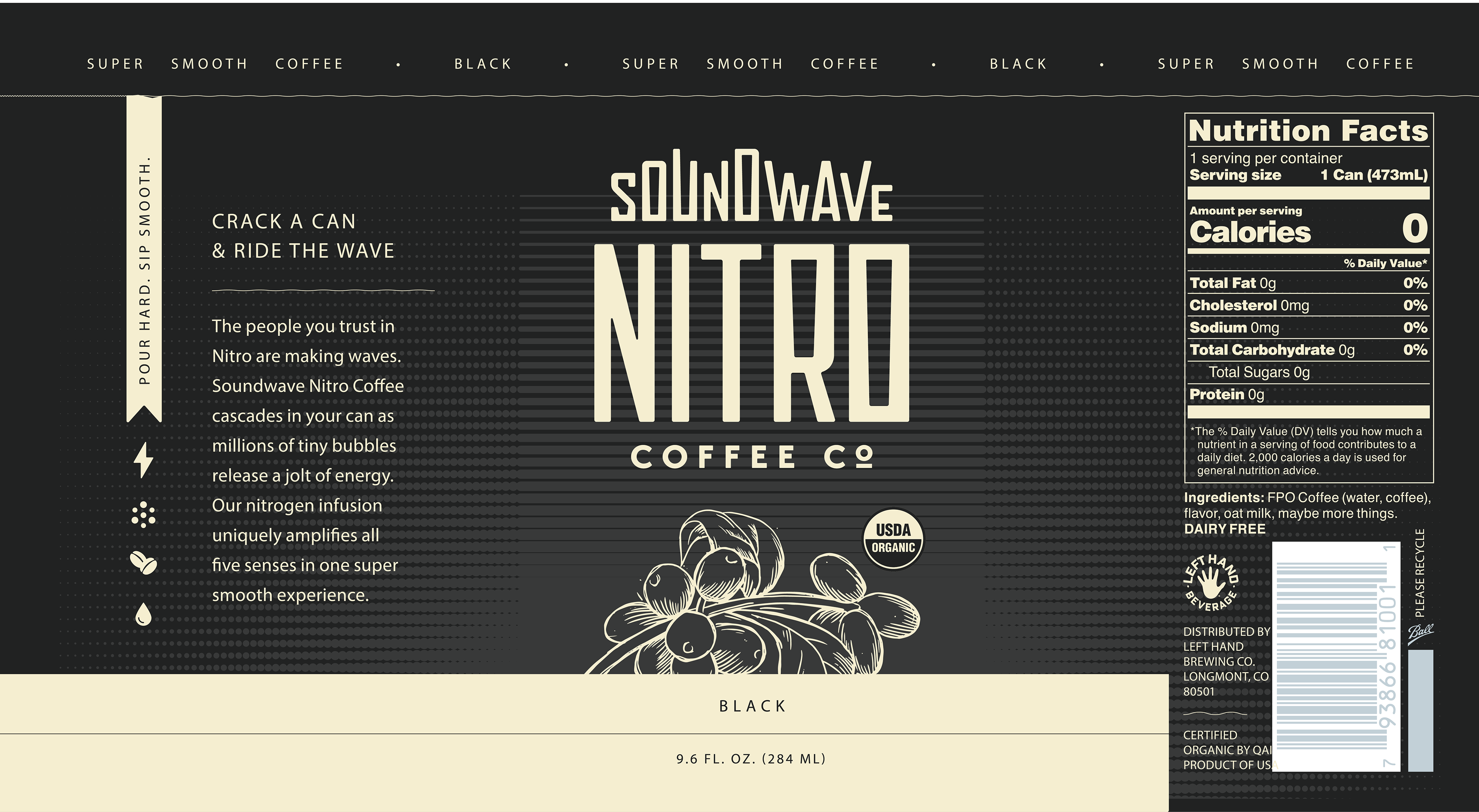
The bold, condensed type would give a nod to the shape of the slim stream and nozzle of nitro. It also lends itself well to the vertical shape of the can. The graphics would be realistic, hand-drawn, possibly block-print style, to convey the idea of organic ingredients. These graphics help offset the bold mark and make it have a human element to it without losing any of the energy from the type lockup.
Textures of wavy lines, dots, or halftones would be used to represent the tiny bubbles of nitro and how they create such a smooth mouthfeel.
Warm colors of the coffee beans and woodgrain keep it soft and welcoming with an opportunity to incorporate some blue tones (the color of nitro) to reflect the push that this comes from the Nitro legends (looking at you, LHB).
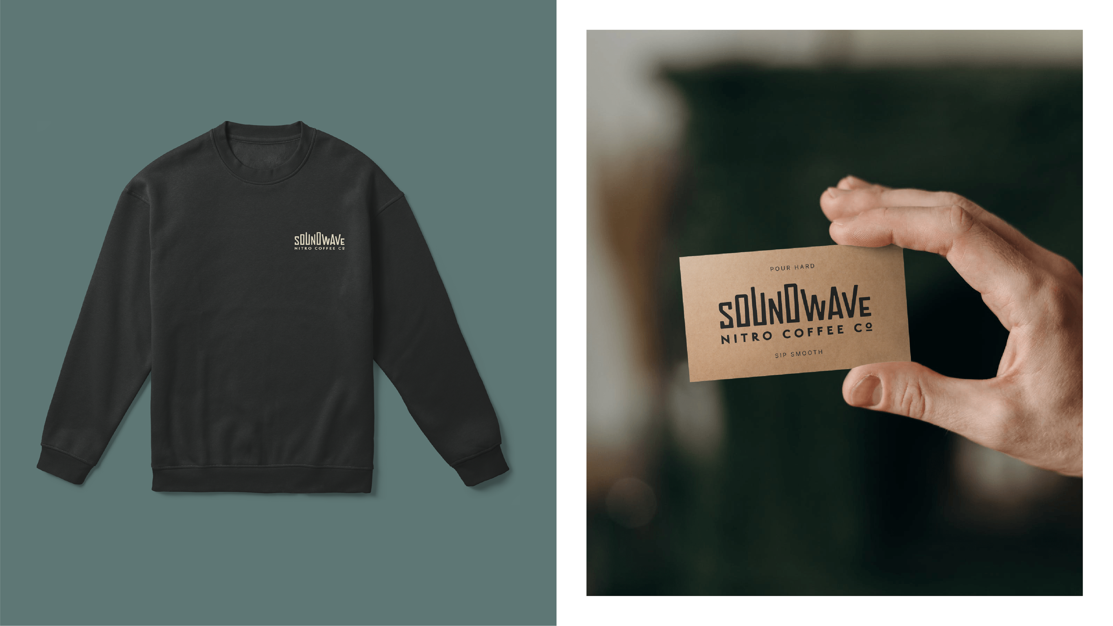
In summary, it’s a blend of something bold and energizing with something organic and handcrafted. It’s elevated enough for the coffee nerds but simple and friendly enough for the average joes just trying not to fall asleep at their desk jobs.
The bold, condensed type would give a nod to the shape of the slim stream and nozzle of nitro. It also lends itself well to the vertical shape of the can. The graphics would be realistic, hand-drawn, possibly block-print style, to convey the idea of organic ingredients. These graphics help offset the bold mark and make it have a human element to it without losing any of the energy from the type lockup.
Textures of wavy lines, dots, or halftones would be used to represent the tiny bubbles of nitro and how they create such a smooth mouthfeel.
Warm colors of the coffee beans and woodgrain keep it soft and welcoming with an opportunity to incorporate some blue tones (the color of nitro) to reflect the push that this comes from the Nitro legends (looking at you, LHB).
In summary, it’s a blend of something bold and energizing with something organic and handcrafted. It’s elevated enough for the coffee nerds but simple and friendly enough for the average joes just trying not to fall asleep at their desk jobs.